Monthly media
Monthly Media has been rehomed!
You can now find it being hosted by ASTRO 3D here. The past MM will stay here until they too are re-homed with the new host (and back-dated).
This is where you will find monthly updates on some of the most interesting research the Epoch of Reionisation group at Curtin University are up to. Not only will there be awesome pictures and/or videos, but details on the science behind them and links to the published (or soon to be published) research papers that back it up.
Monthly media will be updated at the beginning of each month.
Past monthly media
February 2020 How many radio sources are in the sky?
A significant challenge to detecting the weak signal from the Epoch of Reionisation (EoR) is removing all of the foreground emission from bright extragalactic sources. February 2020’s Monthly Media is from Dr Christene Lynch, and highlights the many thousands of extragalactic sources which produce radio emission at the frequencies being searched for the EoR signal. Christene created the below movie by mosaicing images from the Murchison Widefield Array (MWA) in its new, extended configuration.
To remove the bright foreground emission produced by these extragalactic sources, the MWA EoR experiment requires accurate models of their radio emission. Christene creates these models from the still images in the movie. In order to ensure that these models are highly accurate, several tests are performed on the images to ensure that the positions and radio brightness of each source in the image is correct. An example of one of these tests is shown in the below image.
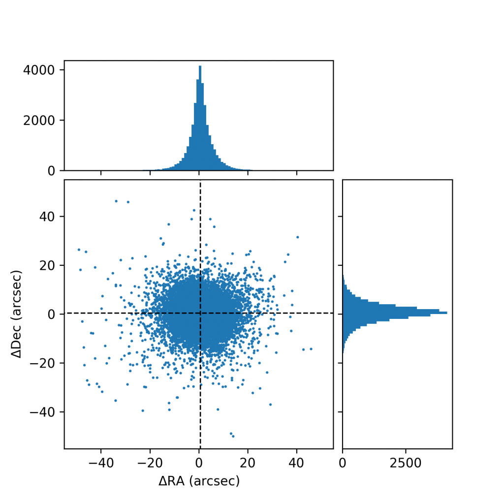
To test the source positions in the MWA images, Christene first identifies the brightest, most isolated point sources and matches them to other radio catalogues. These catalogues report positions and radio brightnesses at similar frequencies observed by the MWA. Differences between the catalogue position and that of the MWA are measured for each of the bright sources. These difference are shown in the above image, where Dec and RA are directions on the sky. The majority of the sources in the images are within a few 10’s of arcseconds from those reported in other catalogues — meaning that the source positions in the MWA images are quite accurate, and the images can be used for modelling!
January 2020 Come in Moon! Can you hear us?
The first Monthly Media for 2020 is from Dr Ben McKinley and undergraduate student Lauren Springer, who bring us a visualisation of FM radio transmissions from Earth that bounce off the Moon and back onto the Murchison Widefield Array (MWA) telescopes.
Some of the radio signals humans use to communicate reach the surface of the Moon that faces towards the Earth, causing it to bounce back down to us, as depicted in the below image. This is a very small effect, but in the search for the extremely faint Epoch of Reionisation (EoR) signal, every piece of noise must be found – and eliminated!

Radio signals from FM radio transmitters around the globe can bounce off the Moon and be reflected back down onto very sensitive radio telescopes, such as the MWA, making it difficult to observe very faint signals from the Universe, such as the EoR signal.
This video shows a simulation of the FM radio signals bouncing off the Moon and back at the MWA. The Moon begins below the horizon for the MWA (the MWA can’t see the Moon), becoming visible between 8 – 22 hours into the simulated observation (or 5 seconds to 14 seconds of the video). The brightness at each frequency (top left panel) becomes very dim around halfway as the Moon is mostly above the Pacific ocean, where there are very few FM radio transmitters.
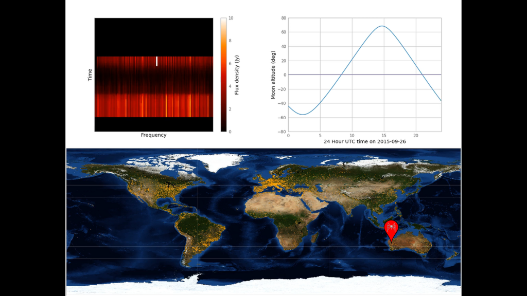
In the bottom panel you see the Earth, as if you stretched its spherical shape into a flat rectangle, with the yellow dots representing all the FM radio emitters within the frequency range of 88.5 – 108 MHz (FMLIST database). In the video, these dots turn red if the MWA (shown with the pin) and the radio emitter can both see the Moon above their horizons at the same time. In the top right panel you can see the Moon’s position relative to the horizon of the MWA. The top left panel shows the brightness of the reflected FM radio transmission at each frequency off the Moon and onto the MWA.
December 2019 Taking Census of the Celestial Seal (Ionosphere)
The final Monthly Media for 2019 is fittingly from Dr Chris Jordan, who brought the year in with his ionospheric “fighter jet” event (January 2019). That event showcased just one unusual piece of ionospheric activity of many thousands of observations. Here he details what can be learned from looking at many events, and what is yet to be understood.

The image of refracted sunlight below the surface of rippling water.
Image credit: unsplash.com @chrislawton
When you look up at the sky at night you are looking straight through the ionosphere; it doesn’t affect what you see as optical light completely ignores it. But, within the lower frequencies of radio astronomy, the ionosphere can distort what is being observed, pushing the image around on the sky. The ionosphere is still not directly visible, but can be “seen” by a change in the position of a radio galaxy from where it should be. The galaxy has not moved, but the ionosphere is refracting its light to make it look like it’s moved. You can think of it like the effect that water waves has on sunlight, as shown in the above image.
The Murchison Widefield Array (MWA), a low frequency radio telescope in Western Australia that can see a very large section of the sky, is an ideal instrument for studying the effects of the ionosphere on radio telescopes, including the MWA itself. This is important for very sensitive observations such as the search for the Epoch of Reionisation (EoR) signal this group is searching for.
Chris has calibrated MWA data from 2013 to 2016, using 18,681 observations from between those years (inclusively – including the years given) over 332 nights, where each observation lasted 2 minutes. These observations were taken with the EoR fields high in the sky – the EoR fields are those believed to have few radio sources, which helps the observation of the EoR (see Ronniy’s Monthly Media from June 2019).
The information considered important for these observations is:
- The distance between where the radio source should be and where it is observed to be (the “offset”) – how far away is the image of the source from where it should be?
- The direction of the offsets – do the offsets point in similar directions? If the directions are similar, it indicates that the ionosphere is active and corrupting our astronomical data. Low values are around 55%, high values are more than 70%.
The source positions are measured in reference to the PUMA source catalogue.
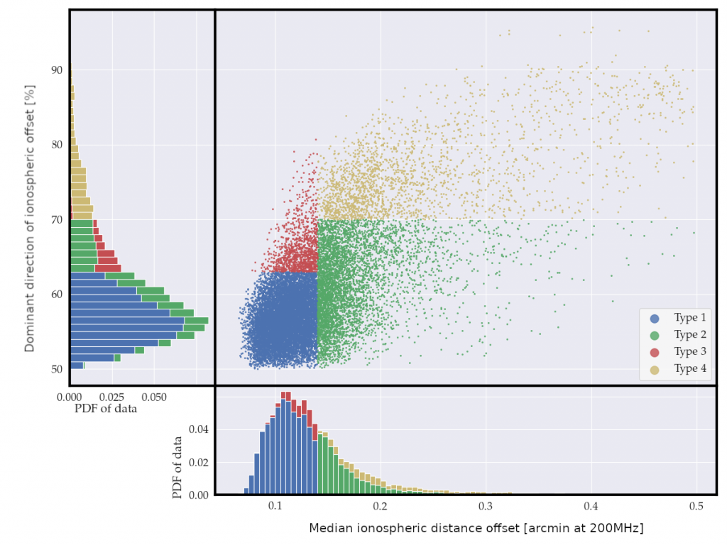
The y-axis is the dominant direction of each observation’s offset. The x-axis is the middlemost value of each observation’s distance offset. The main section (top-right) shows where each observation lies against those axes. The bottom section shows where that same data would “fall” onto the x-axis, the distance offset. In the same way, the left section shows where the data would “fall” onto the y-axis, the direction offset. These sections show that most of the observations are in the lower-left corner of the plot – exhibiting a “well behaved” or “good” ionosphere. Four types of ionospheric activity have been arbitrarily chosen to help categorise the data, shown in the different colours.
The above plot shows how all the 18,681 observations are split into four different types: 1, 2, 3 and 4. The type 1 observations, the most common, are the “inactive” ones (considered “good”). These observations are the best for searching for the faint EoR signal, and other sensitive radio astronomy. The type 4 observations are the “extremely active” observations, and cannot be used for radio astronomy (considered “bad”). It is the type 2 and 3 observations that are less clear on useability for radio astronomy.
Type 2 observations have large offsets in the position of a distant radio source, but within an observation do not favour any direction. Type 3 have small offset distances within each observation, but there is a preferred direction of the offset. The consistent direction, though small offset, from the type 3 observations has a larger effect on the data quality, and is therefore considered worse than type 2.
The below plot shows observations of 34 nights that have a “good start, good middle and bad end”. While the most common type of activity over a night is “inactive” from start to end (50% of the nights observed), it is also reasonably common for the ionospheric activity to start as “inactive” and become “active” over the night (about 17% of the nights observed).
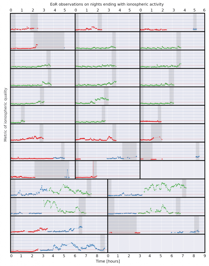
34 nights with a “good start, good middle, bad end”. The red horizontal line is the threshold for “goodness”. The dark grey regions show the “start” and “end” of each night. For a “good start” all individual observations are below the red line. For a “good middle” there is a run of at least 10 individual observations below the red line. For a “bad end” at least one individual observation is on or above the red line.
Classifying the types of ionospheric activity is only the beginning; understanding what is causing these events is important not only for the study of the outer layers of the Earth’s atmosphere, but also for the detection of the EoR, one of the weakest radio signals from the early Universe.
November 2019 Observing with the Engineering Development Array
November 2019’s Monthly Media was of nearly 2 days of observing with the Engineering Development Array 2 (EDA2) at the Murchison Radio Observatory (MRO), from Associate Professor Randall Wayth.
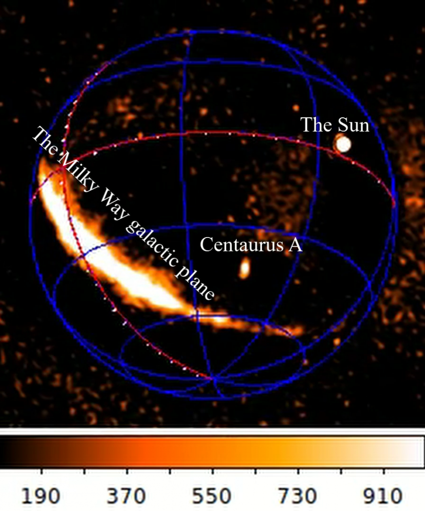
A snapshot as the Milky Way, the Sun and the nearby galaxy Centaurus A pass overhead.
This movie shows snapshots of the radio sky above the Murchison Radio Observatory taken at 64 second intervals at a frequency of 230 MHz, covering roughly 1.75 days of continuous data. The colour bar at the bottom shows radio intensity (brightness) in the commonly-used astronomer units of Jy/beam (Jansky per beam). The celestial coordinate system (CCS) is also overlaid on the image to aid the eye (the gridded circle), and the apparent low-level radio emission outside the CCS is an artefact of the imaging process and is not real.
The EDA2 tests the proposed antenna layout of the SKA-LOW using the current technology of the Murchison Widefield Array (MWA) dipoles.
October 2019 Compressing models of radio galaxies for Epoch of Reionisation science / How much can we squish a model before it ruins our squiggly line?
October 2019’s Monthly Media was from Dr Jack Line, who discusses where to draw the line when fitting a model to data.
The Epoch of Reionisation (EoR) is primarily characterised by the formation of the first stars and galaxies in the Universe, and it is this signal that the Curtin EoR group is trying to detect. This is being investigated by looking at how those first stars blew bubbles in the neutral hydrogen they were born in.
Our method is to make a power spectrum estimate of the 21cm emission from ancient hydrogen (see the monthly media from August 2019 for a run down of power spectrum signals, and our front page for details on the importance of the 21cm hydrogen line, under the drop down menu “Epoch of Reionisation”).
The most compact way to visualise this is in the below 1D power spectrum plot, which shows six simulated examples of a 1D power spectrum.
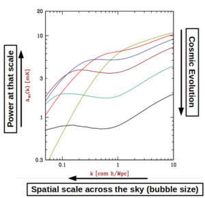
Figure from Barkana et al. (2009). The x-axis represents the size of an object on the sky from right to left, so little things are on the right, big things are on the left (size being referred to as ‘spatial scale’). The y-axis shows the power at that spatial scale, or you could think of it as how common things of that size are; if all your power is on the right side, there are lots of tiny objects (eg dots) on the sky. If all your power is on the left, the sky might look like a bunch of big fluffy clouds. In the above figure, the lines at the top of the plot are earlier in the life of the Universe, so the Universe ages from the top line (green) to the bottom line (black).
If you study the figure, you’ll see a bend in each line, which moves from the right (small scales) to the left (big scales) as the Universe ages, which can be explained by more and more stars blowing bigger and bigger bubbles in the hydrogen over time.
We want to measure this for the real Universe, and the way that the power spectrum changes shape over time gives us information on the types of stars causing the ionisation, how they are distributed, the overall number of stars, and what kind of radiation they emit.
Viewing into the Universe’s history from Earth with the MWA; The number and size of the bubbles around the stars and galaxies changes as the Universe ages (right to left). Earth Image: NASA, HDF Image Credit: NASA/ESA/HUDF09 Team.
As discussed in previous monthly media’s, this signal is buried under other sources, some of which are massive on the sky. In the July 2019 monthly media Jack has discussed how one way to model the galactic monsters is by using shapelets.
To detect this signal, we have to process huge amounts of data (100s to 1000s of terabytes), and so we’re always looking for ways to speed up our processing. One way to do this is to compress the models we use to calibrate and subtract from our data.
With any compression comes some kind of quality loss, so how do we know how far we can compress our models? One way is to look at the residuals left behind after subtracting the model in a power spectrum plot, as shown in the video here.
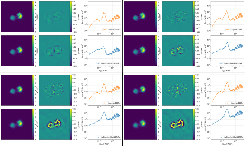
Within each frame of the above image, in the left column are two models of Fornax A, the top one modelled using shapelets, and the bottom made of point sources and Gaussians, which are the outputs of a process called multiscale-CLEAN; one way to make images from telescopes like the MWA. In the middle column, we see the image residuals after subtracting the models from the data they were modelled after. In the right hand column, we see 1D power spectra of those residuals. The image shows the four frames of the video from left-right, top-bottom.
In the above images and associated video the most straight-forward compression possible has been applied – the components in a model are ordered by how bright each is, and a certain percentage of the dimmest components has just been thrown away.
From one image to the next you’ll see the overall power in the power spectra increase, as the models are compressed, making the residuals looks worse. You might also notice the models on the left look like they are going out of focus; the finer details tend to be the dimmer points, and so get removed in this method.
Most importantly for EoR science, shapelets consistently outperforms multiscale-CLEAN on the largest spatial scales (the power on the left hand side of the power spectrum is always lower for shapelets). This is where the EoR signal is expected to give the most information, and is therefore an important consideration in choosing the best method.
Promisingly in these early tests the compressed shapelet model runs as fast as the full multiscale-CLEAN model as well, and so comes with no processing time penalty. Every little bit helps in the search for the EoR.
September 2019 A short-spacing interferometer to observe the early Universe
September 2019’s Monthly Media was from Dr Ben McKinley, showing the effect of radio-telescope antenna placement on observing the weak hydrogen signal from the early Universe.
Hydrogen atoms in the early Universe should emit a distinctive radio signal that, if detected, could inform us about the first stars and galaxies and how and when they formed. A component of this signal is constant across the sky and could in principle be detected by a pair of closely-spaced dipole antennas, if the bright foreground emission could be removed.
In this animation Ben shows a simulation of such an observation, for a number of antenna configurations. By rotating the pairs of antennas, the spatially-varying foregrounds are averaged out as the signal is summed, while the constant hydrogen signal is unaffected.
In the animation the antenna configurations are shown in the top left, where the residual signal is shown in the top right after removing the foregrounds by subtracting an 8th order polynomial fit to the data (the simulation contains no hydrogen signal, only foregrounds, however a possible hydrogen signal shape is over-plotted in yellow). The bottom panel shows the root-mean-square of the residuals from above for each antenna configuration.
The more antenna rotations, the better the foregrounds are removed and the greater the chance of detecting the hydrogen signal from the early Universe.
August 2019 How to look for an Epoch of Reionisation Signal.
In past monthly media (see March and April 2019), we have shown an image called the power spectrum. To celebrate National Science Week this month, PhD candidate Ronniy Joseph explains why we use power spectra in the search for the Epoch of Reionisation (EoR) instead of looking at images of bubbles.
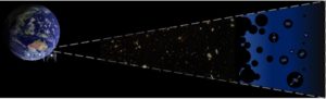
You may have already learned that the radio signals from the EoR are extremely faint compared to bright foreground galaxies close to us (about 10,000x fainter). On top of that we are also limited by the sensitivity of our radio telescopes. The Murchison Widefield Array (MWA) with over 4,000 antennas would still several years of full time observing to directly capture an image of the formation of the first stars and galaxies, unlike the Square Kilometre Array (SKA).
Viewing into the Universe’s history from Earth with the MWA. Earth Image: NASA, HDF Image Credit: NASA/ESA/HUDF09 Team
Instead of staring at the sky for decades or waiting for the SKA to be built we choose to use less time and instead use a mathematical tool called the power spectrum. Before we go into explaining what it is, let’s first look at a very important property of the Universe we live in.
When we look at the Universe at the largest scales, we see that the universe looks more or less the same at different locations (uniform) and in different viewing directions (isotropic). This is particularly useful when you’re trying to detect a signal that’s fairly weak. This means that if we look at a piece of volume in the Universe, it does not really matter in which direction we look because it’s properties should be the same.
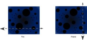
You and a friend travelling through the Universe during the EoR in different directions, keeping track of the size and number of ionised ‘bubbles’ you find along the way. If you travel far enough, you will count the same number and sizes of bubbles, because the Universe is uniform and isotropic.
Imagine yourself and a friend travelling through a cube of the Universe in two completely different directions, as shown in the above figure. You decide to keep track of what you find along the way: the number of bubbles of a certain size. You’d find exactly the same number if you travel far enough. It is this property that enables us to spend less time collecting radio waves and use the power spectrum. Instead of looking at how bright the hydrogen signals are at a certain location in the Universe, we take that entire volume we’re observing and look at how much the signal changes as a function of so-called scale size.
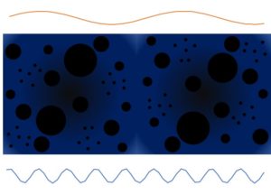
Looking at a large section of the Universe during the EoR, there are different numbers of large and small bubbles, corresponding to long and short size-scales in the data our telescopes collect. The ratio of long to small scales tells us about the structure of the Universe where and when we’re looking at.
Does the signal change fast on short scales, or does the signal change slow on large scales? Having lots of tiny ionised bubbles (early stage) would mean the signal changes more at the small scales. Later on when the bubbles overlap (late stage) we’d expect changes on the larger scales. The above figure offers a potential snapshot of the ratio of the small to large bubbles during the EoR.
By calculating the power spectrum we overlay these wavelike functions, and determine how well they describe changes in the signal. We do this for various waves in all different directions (3D-Power Spectrum). And because the Universe looks the same in all directions, we can sum up the contributions for waves of the same shape in different viewing directions. This allows us to condense this 3D wave information into 2D and even down to 1D. This enables us to add all of that signal in the entire volume we’re observing making us even more sensitive without observing for many more years.
In future monthly media we’ll discuss different properties of the various power spectra.
July 2019 Building a Radio Galaxy
July 2019’s Monthly Media was from Dr Jack Line, showing how radio observations are processed to build up an image of a galaxy.
As shown in previous Monthly Medias, some galaxies emit radio waves, and can be huge on the sky, with complex structures. As we’re hunting a radio signal from the young Universe, during the Epoch of Reionisation (EoR) when the first stars switched on, these radio-loud galaxies are in the way and have to be removed. One such galaxy is Fornax A:
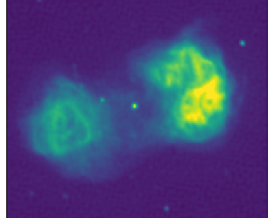
The complex and epic radio galaxy Fornax A (image credit Ben McKinley)
When confronted with a galaxy such as Fornax A, how do we efficiently model the beastie, so we can remove it from our data? When fitting a model to data, we often use what are referred to as ‘basis functions’. You can think of them as a set of unique building blocks, that you can split any image up into, to build it back up from.
One useful set of basis functions is known as ‘shapelets’, which are two-dimensional, and labelled with two numbers, n1 and n2. You can see the first 16 of them below, with their n1,n2 labels above each image:
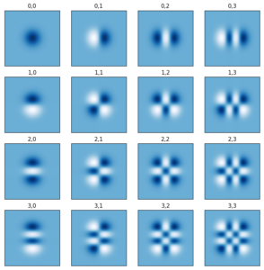
The first 16 shapelet basis functions. In each of these images, dark blue means a positive area, and white means a negative area.
As shown here, they contain set patterns, which give finer and finer detail as you go higher in n1,n2. They are quite complex, but this complexity means we can describe large and fiddly structures with small amounts of information.
To model a galaxy like Fornax A, we end up using around 3,500 shapelets in total (so 3,500 images like those shown in Figure 2). This might sound large, but considering the above image of Fornax A has over 30,000 pixels, this ends up being a more efficient way of describing the information when we create models for calibration with a telescope like the MWA.
The nuts and bolts come down to finding a single number for each shapelet basis function to multiply by, such that when you sum together all the basis functions, you create an image that matches the original. Once you’ve done this fitting, you can then build up an image of your galaxy basis function by basis function, as shown in this video.
June 2019 Where to look for an Epoch of Reionisation signal
In the search for the elusive Epoch of Reionisation (EoR), one of the fundamental questions that needs answering is “where do I point my telescope?”. June 2019’s Monthly Media from PhD student Ronniy Joseph answers exactly that, as well as the equally important question of “when do I look?”.
To observe the faint signal from neutral hydrogen atoms during the EoR we need to observe the sky for over 1000 hours.
Unfortunately the sky is full of bright objects that also emit radio waves. In earlier Monthly Media’s we have discussed the impact the bright radio structures have, and why we need to stay well clear of those to be able to detect the EoR with the Murchison Widefield Array (MWA).
![]()
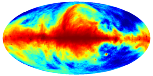
The Milky Way as seen in the radio spectrum [Haslam et al. 2014/Skyview], with the three different EoR search fields for the MWA telescope overlayed. Each EoR field is in a region of the sky where there is little diffuse radio signal such that the EoR might be detected.
In practice this means we only take observations during 3 months in the year: September (EoR0), November (EoR1) and January (EoR2). The reason why is shown in the above figure. Here’s a map of the sky, similar to a map where we unfold the the map of the Earth onto a square. The circles show which parts of the sky we look at, at specific months in the year. So why only these parts?
Like Cathryn Trott showed in March 2019’s Monthly Media, the Milky Way is a problem. By looking at these parts of the sky we can stay well clear of that. But there are also other bright radio sources in the Universe.
These other spots on the map are radio galaxies that host supermassive black holes, some of them even emit bright radio jets. It’s especially those with complicated structures and jets that make it hard to observe the EoR, shown by Dr. Christene Lynch in the Monthly Media of April 2019.
This means we want to look for the EoR on locations of the sky that are free from the Milky Way and other complicated radio sources.
However we do need a few bright sources around, that ideally look like points to our telescope. These bright point-like radio sources are needed to fine-tune the telescope’s antennas, this was discussed in Ronniy Joseph’s recent paper.
Finding the right field-of-view window for searching for the Epoch of Reionisation is a balancing act. Luckily there are three such windows throughout the year and across the sky in which the search can be conducted for the EoR with the MWA telescope.
May 2019 How distance between Murchison Widefield Array antennas changes imaging
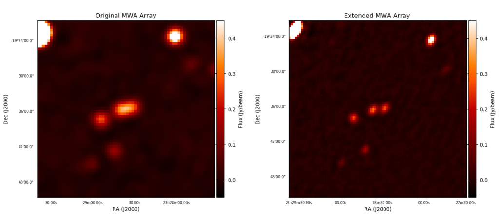
Comparison of images that appeared to be of single point sources in the original MWA image (left) to what is now resolved into multiple sources in the new MWA image (right).
May 2019’s Monthly Media is a comparison of Murchison Widefield Array (MWA) images from Dr Christene Lynch, before and after upgrades to the telescope. The MWA is a radio telescope located in outback Western Australia first constructed in 2012, and in 2017 was added to with more antennas and longer baselines, giving it a better view on the Universe.
With this change comes a renewed need to understand the telescope and how it observes the sky. The telescope needs to be calibrated, meaning its observations need to be measured against a known quantity, in order to be able to accurately interpret its images. Calibrating the data from the MWA requires accurate models of the radio sky at the frequencies that it observes.
For the Epoch of Reionisation (EoR) experiment, accurate sky models for radio sources are especially crucial. The goal of this experiment is to detect the weak EoR signal from the early Universe, which is obscured by bright foreground signals from extragalactic sources and our own Milky Way Galaxy. Radio sky models provide a way to subtract the bright foreground emission and help to reveal the EoR signal.
To improve the sky models used by the EoR experiment to calibrate and subtract the foreground emission, Dr. Lynch is using the upgraded Phase II MWA to survey the region of the sky used by the MWA EoR experiment. The newly expanded MWA has radio antennas spread over a larger distance and now provides higher resolution imaging to compliment the original MWA imaging of the Southern radio sky. Using the expanded MWA, Dr. Lynch is now finding that some single sources, previously imaged by the MWA, are now resolved into multiple sources (pictured above).
Additionally, the higher resolution imaging reveals more complex structure in bright extended radio galaxies, such as Fornax A (pictured below).
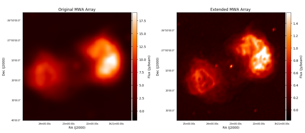
Comparison of images of Fornax A from the original MWA (left) and the new extended MWA (right).
By combining both the original and new MWA images of these complex sources the best models can be created, allowing for the removal of their bright emission from the EoR data.
April 2019 In search of the Epoch of Reionisation
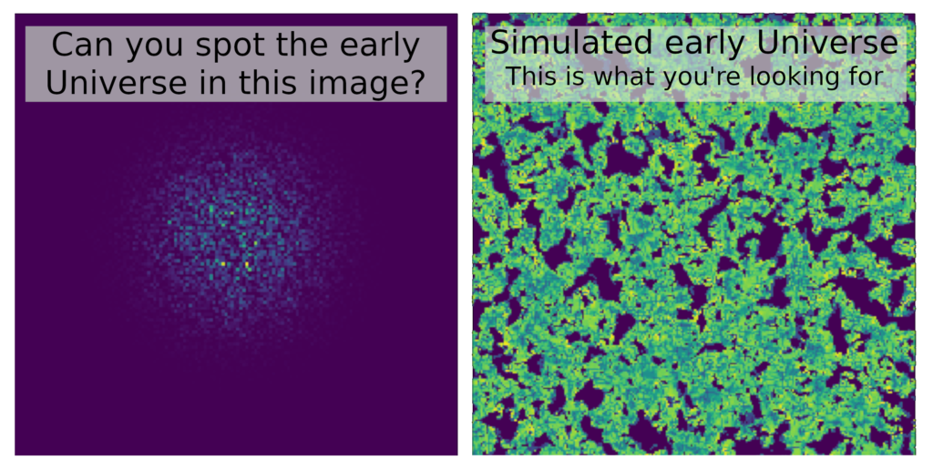
Finding the faint signal of the first stars and galaxies (simulated on the right) in a radio image of the sky (simulated on the left) is not possible with the human eye – computers are needed to untangle this riddle.
April 2019’s Monthly Media is a progression of images from PhD student Bella Nasirudin that shows the steps involved in simulating what the Murchison Widefield Array (MWA) will observe of the Epoch of Reionisation (EoR).
Bella aims to understand the underlying physics of the EoR from the neutral hydrogen signal that was everywhere during the early Universe, which can be observed by radio telescopes.
The first step is to generate the EoR signal (pictured below), which is actually due to the contrast of the bright sources and their surrounding area to the neutral hydrogen.
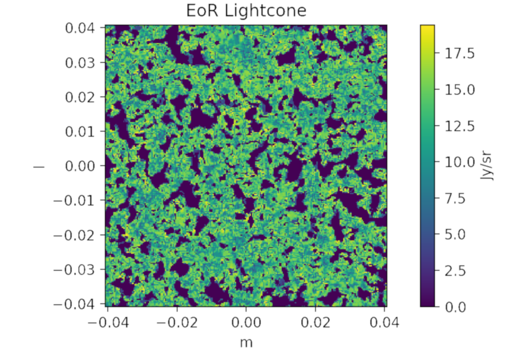
A simulation of what a 1 Gigaparsec x 1 Gigaparsec square of the EoR signal is expected to look like. 1 Gigaparsec = 30,000,000,000,000,000,000,000 kilometres.
The EoR signal travelled about 12.7 billion light years to reach our telescopes, and that huge distance makes a large simulated box of dimensions 1 Gigaparsec x 1 Gigaparsec appear as only one tenth of the field of view of the MWA. In order to overcome this, the box is repeated across the sky, stitched and coarsened together to match the angular size of the MWA beam (result pictured below).
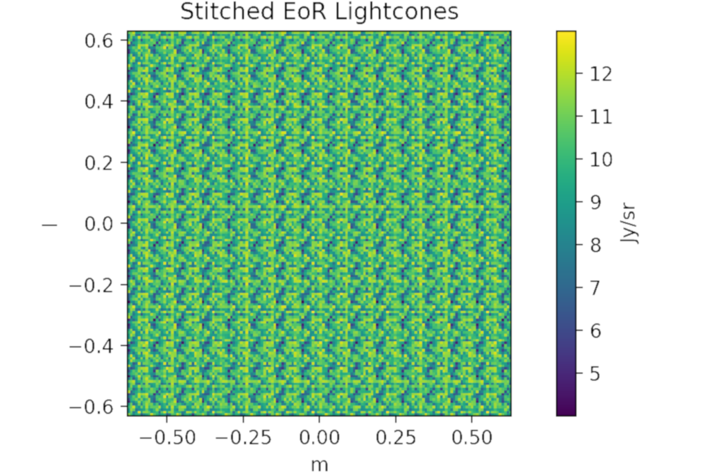
Stitched EoR signal. In order for the EoR signal to cover the same angular size as an MWA observation, we need to stitch together the previous EoR image about 10 times across both axes.
The point source foregrounds (pictured below) are made up of extra-galactic sources, like star-forming galaxies and active galactic nuclei, and reside between our telescopes and the EoR signal. These foregrounds dominate the MWA images when searching for the EoR, being 10,000 – 100,000 times brighter.
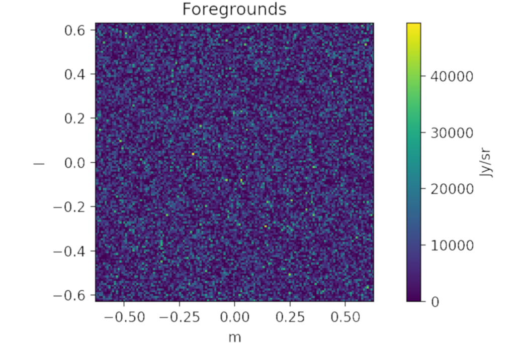
A simulation of the foreground star-forming galaxies and active galactic nuclei, as would be seen in an MWA observation.
The faint EoR signal and the bright foregrounds signal are then combined with each other and then convolved with the beam of the MWA (pictured below).
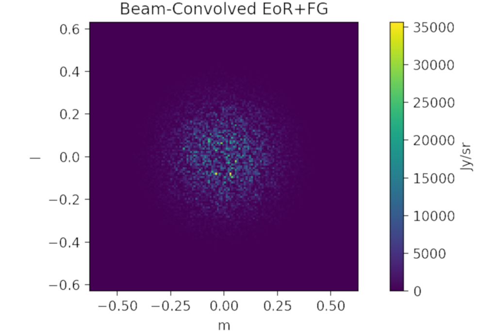
The result of combining the EoR signal with the foregrounds image, then convolving that with the MWA beam. This is the expected MWA image.
The last steps are a series of mathematical functions to get out the power spectrum (pictured below). The power spectrum shows on what spatial scales the power from an image comes from. In plain English, this means that if lots of signal is coming from something that looks large in the image (has a large angular size) and is nearby then the power spectrum plot will show brighter features in the lower-left areas.
The power spectrum. This shows the amount of power different spatial scales have for the simulated EoR signal, as seen by the MWA.
March 2019 Foreground effects in the search for the Epoch of Reionisation
Left: The power spectrum image, which breaks the radio observation into its component scale-structures. Right: The visible sky above the telescope for each observation, overlayed with the telescope’s beam pattern.
March 2019’s “Monthly Media” is from project lead Associate Professor Cathryn Trott, and showcases how the search for the Epoch of Reionisation (EoR) is affected by the presence of the Milky Way and other galaxies within an observation.
The EoR project is hunting for a weak signal from the early Universe. To detect this signal, parts of the sky that are free from emission from our own Galaxy and other nearby galaxies are observed.
The effect the Milky Way and other galaxies has on the power spectrum observations can be seen in this video.
The power spectrum is the generated diagram on the left of the video and the below images, showing the amount of signal power on different size scales on the sky.
When the observation passes over bright parts of the sky (e.g., the Galactic Anti-Center at RA = 8 hours – towards the end of the video), we can see the signal power increase. In the below images, the first shows when the Galactic Anti-Center is far from the primary beam, and the second shows when it is within the primary beam.
Can see the effect of the changed position of the Galactic Anti-Center in the images (right) on the power spectrum (left). The increase of power in the lower power spectrum plot destroys the ability of being able to detect the EoR.
These increases in power destroy an EoR observation, as they obscure the same scale-frequencies the EoR signal is expected occupy.
This information helps to define the observing fields for the EoR experiment and bring its detection closer.
February 2019 How a Square Kilometre Array prototype will see the sky
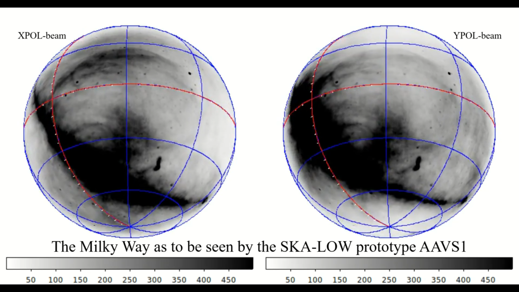
Two antenna polarisations of how AAVS1 is expected to observe the sky. Depending on the polarisation of the antenna, there will be higher intensity in different parts of the image. Left: XPOL-beam polarisation. If you look closely you can see there is more detail towards the top and bottom of the observation. Right: YPOL-beam polarisation. Similarly, there is more detail at the sides of the observation.
February 2019’s “Monthly Media” is from PhD student Mike Kriele and is a simulation of how the Square Kilometre Array Low’s (SKA_LOW) prototype the Aperture Array Verification System 1 (AAVS1) is expected to observe the Milky Way as it passes overhead.
The 1440 images that compose the video are a combination of decades old well-established observations of the Milky Way (the revered Haslam Map) simulated through the field of view of how the AAVS1 sees the sky.
Mike has taken the Haslam map (pictured below) and remapped it to show only what will be visible above the Murchison Radio Observatory where the SKA core and AAVS1 are located, removing the section of the sky blocked by the Earth from the Southern Hemisphere.
This all-sky image was published in 1982, and was generated by taking many small images of the sky and stitching them together (mosaicing), using a combination of single-dish and interferometric telescopes to image different sized features.
Each telescope has a unique ‘window’ through which it views the Universe, known as the beam pattern. Mike has taken the expected beam pattern of the AAVS1 antenna and mapped two polarisations of the telescope as the Milky Way Galaxy passes overhead.
As the observation progresses, the two polarisations of the beam’s affect the observed intensity in different parts of the images, and you can see features appear and disappear as the telescope’s angle on the sky changes.
Mike will use these simulations to test a new method (known as spherical harmonic decomposition) with the SKA prototype in the Southern Hemisphere. This method will allow for the observation of a broad set of scale sizes within one observation, instead of requiring a combination of different single-dishes and interferometers.